If you'd like to size your images to fit a specific container, follow the specifications below. All images should be saved at 72 dpi at the pixel dimensions noted below, and should follow the pixel proportions. These dimensions are larger than how they appear on screen, but this allows for varying screen resolutions, including retina displays.
Larger images will be sized down while smaller images will be sized up and can become blurry. You can always use the edit tool (the pencil icon above each image frame) to adjust the positioning of your photo in the frame.
COVER PAGE
Size: 3200 x 2000 pixels
This image is what we call a poster image. That means it will fill your screen regardless of the size or orientation of your browswer window / device. See the Image Cropping section below to better understand how your image will fit and behave in this container.
CONTENT PAGES
Every content page has the option of 7 different section layouts. Each image has 3 size options (short, medium and tall).
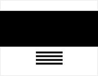
Full Width
This image will always fit the width of your browser window.
Short: 3200 x 1250
Medium: 3200 x 2124
Tall: 3200 x 4270
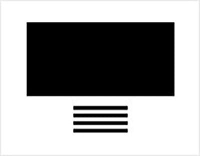
Large Image
Short: 1800 x 680
Medium: 1800 x 1200
Tall: 1800 x 2400
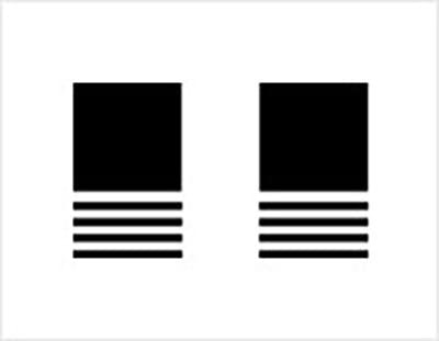
2-Up
Short: 750 x 550
Medium: 750 x 750
Tall: 750 x 1000
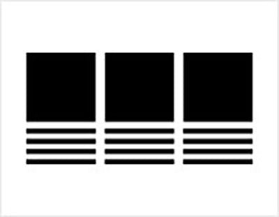
3-Up
Short: 750 x 550
Medium: 750 x 750
Tall: 750 x 1000
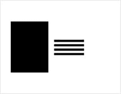
Staggered Left + Right
Short: 860 x 573
Medium: 860 x 860
Tall: 860 x 1287
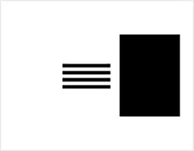
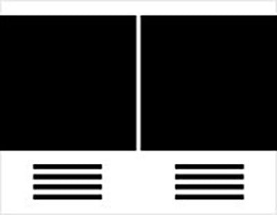
Split Screen
Short: 2000 x 1250
Medium: 2000 x 2000
Tall: 2000 x 3500
GALLERY PAGES
There are 3 options for gallery page layouts.
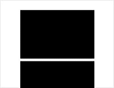
Large Image
Size: 1820 pixels wide at any height
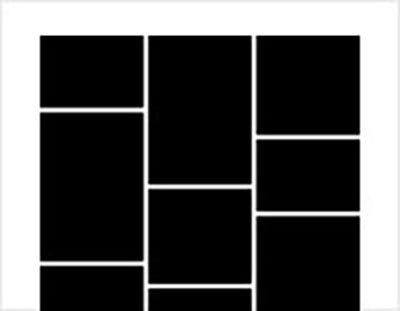
Staggered
Size: 335 pixels wide at any height
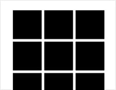
Grid
Size: 750 x 750
When it comes to image sizes and proportions there is not a one size fits all approach, since we offer a multitude of options. Every page layout has a uniquely sized image that also comes with 3 height options. You can easily switch between section styles and image heights to find the best fit. Use the editing tools available to perfect the view of your image in the 'frame'.

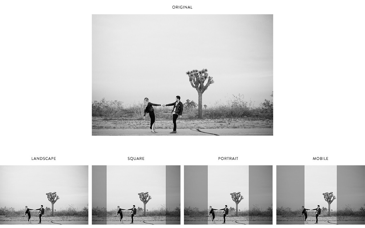
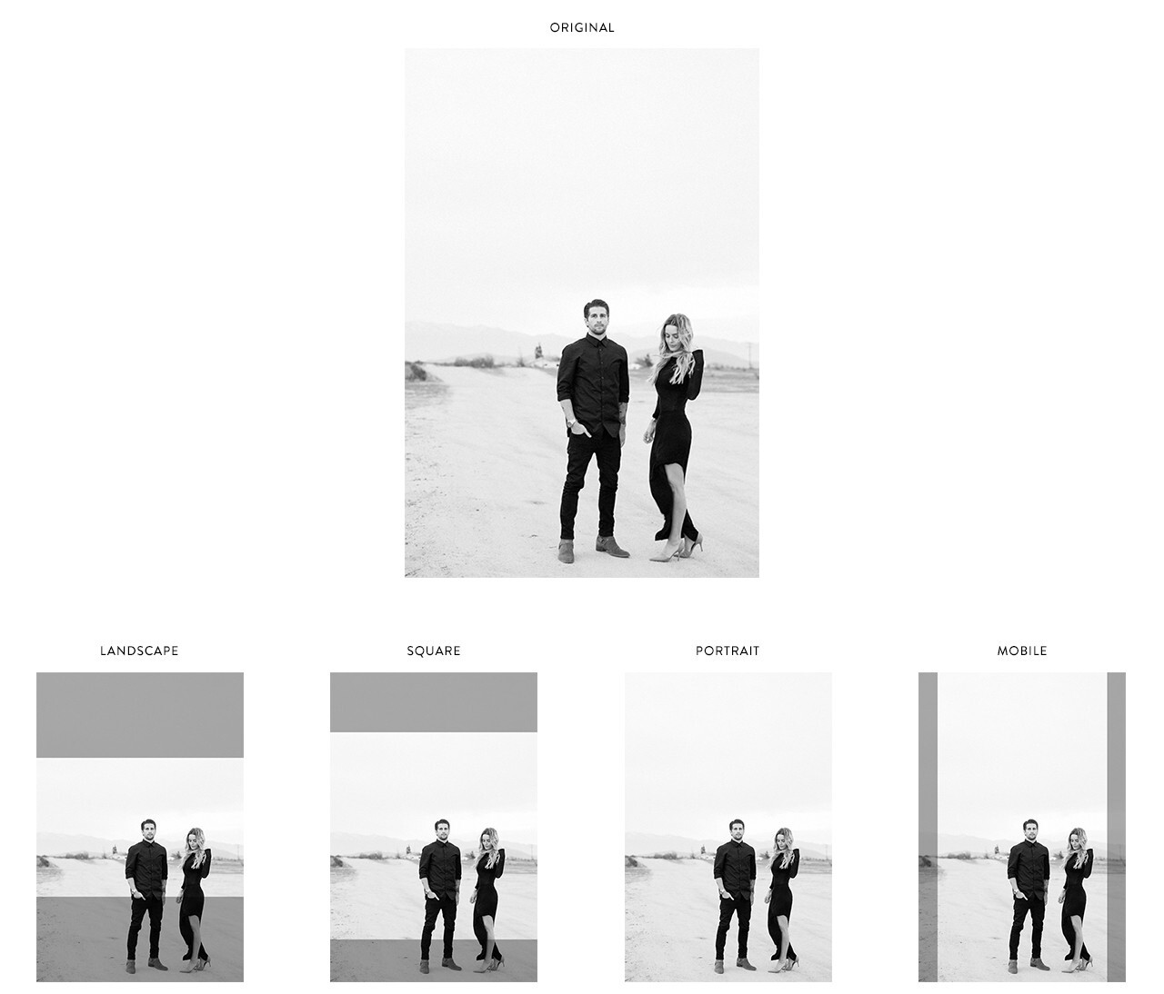
It is best to assess your original image and then decide the best 'frame' or container. Here are examples of how your image will be sized and cropped in the various containers. Cover page images are treated in an entirely different manner — they are handled as poster images. This means that the image will fill the designated area on the screen no matter the size of the device or browser window. It is always best to keep the focal point of the image in the center to avoid cropping.
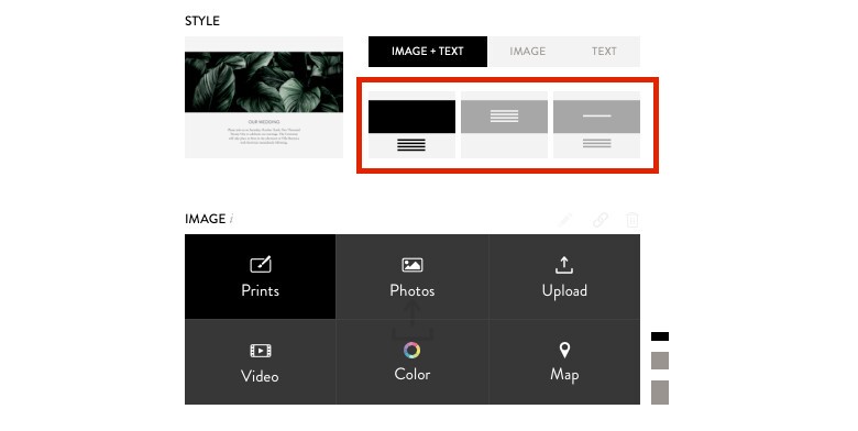
Above each image container there are three options for your text:
Left: All Text Off Image
Center: All Text On Image
Right: Header Text On Image
Yes! Every place on your site where you can put in image, you can put a video. Click on "Video" and add the embed code from YouTube or Vimeo.
Please note that you cannot embed / upload a full screen auto-play video on the large cover page option.
The most landscape (wide image) image options will have options to optimize for mobile. To customize how your images look on mobile, click on the pencil icon in the upper right (to edit the image). In the edit overlay there are two options specific to mobile:
Note that unless you select the “do not crop” option, landscape images have to crop on a mobile device.
Please also note that the "do not crop" option is not available for the large cover page.
If your website doesn’t appear to be saving images, it is likely due to the size of the images being added to the website.
In general, all images should be less than 1 MB in size. And, when adding lots of images to a gallery, we recommend adding a few at a time, and then saving. If images are too large, it takes too long for the browser to save the data, and it will also likely take more time for your guests to load your site.
If that doesn’t seem to work, we always recommend logging out of your account, and then logging back in, just to make sure the browser has not logged you out of your browser session.