Start Designing for Free!
By Bliss & Bone
March 2026
The fonts on your wedding invitation communicate tone before a guest reads a single word. A high-contrast calligraphic script signals formality. A clean sans serif signals modernity. The combination you choose sets the expectation for the entire event. This guide covers the main font categories, how to pair them, and which styles work best for different wedding aesthetics.
Serif, sans serif, script, and display are the four categories that define wedding invitation typography. Most invitations work with two: one expressive font for names, one neutral font for everything else.
Serif fonts have small finishing strokes at the end of each letterform, the defining feature of typefaces like Garamond, Playfair Display, and Merriweather. They read as traditional, formal, and considered. Serif fonts are the natural choice for classic and vintage wedding aesthetics and handle supporting text particularly well — dates, venue names, and event details.
Sans serif fonts remove those finishing strokes entirely, producing a clean, unornamented letterform. Fonts like Inter, Montserrat, and Work Sans fall into this category. They read as modern and minimal and work particularly well as the secondary font in a pairing, handling logistics while a more expressive primary font carries the names.
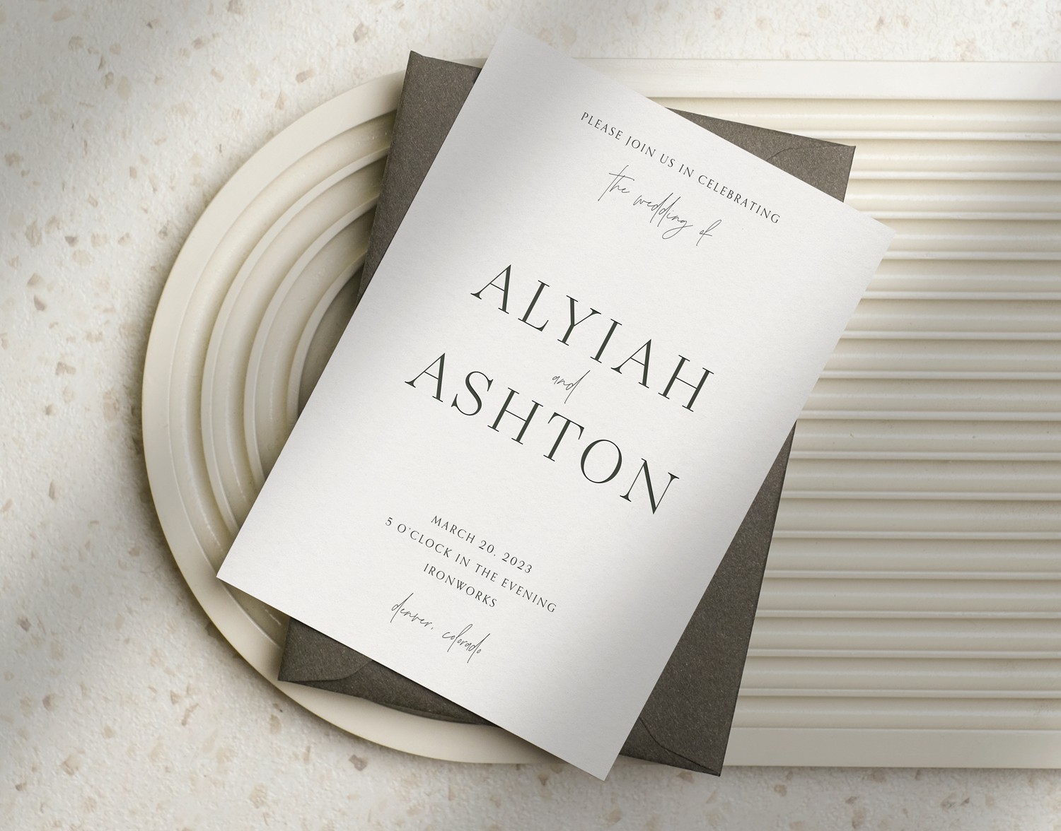
Script fonts are modeled on handwriting, with connected or flowing letterforms and variable stroke weight. They range from formal display styles to looser, more organic forms. Script is the most common choice for couple names on an invitation, adding warmth and personality that serif and sans serif fonts do not naturally provide.
Handwritten fonts are the casual version of script. The strokes appear more natural and uneven, as if written quickly rather than with deliberate craft. They suit relaxed weddings — garden parties, backyard celebrations, outdoor venues — and read as personal rather than polished.
Calligraphic fonts replicate the thick downstrokes and thin upstrokes of a nib pen. They are the most formal and decorative of the script-adjacent styles, and the best digital versions retain the variation and movement of true hand lettering. For printed wedding invitations, calligraphic styles carry particular presence on paper, especially on textured or cotton stock.
A strong pairing works through contrast, not similarity. Two scripts compete for attention. Two sans serifs collapse hierarchy. The most reliable approach is one expressive font for names and one neutral font for the remaining text.
The most reliable pairings follow contrast logic: combine fonts that differ in category but share compatible weight and period. A serif paired with a script reads as classic and romantic. A sans serif paired with a handwritten font reads as modern and personal. A calligraphic script alongside a clean sans serif is the go-to combination for formal invitations that do not feel stiff.
The italic version of any font in your design is a low-risk way to introduce a third layer of hierarchy, commonly used for "reception to follow," "and," or accent phrases, without disrupting the overall type system.
Within Bliss & Bone's collection, these are the most-used pairings across popular invitation styles:
Serenity + Inter Medium (Arlo, Navy designs): Serenity handles names and the date; Inter Medium carries the supporting details. The contrast between a flowing display font and a neutral sans serif is readable at every text size and works across both digital and printed formats.
Abramo Script + Orpheus (Carmella, Smith designs): Abramo Script on the names, Orpheus in upright and all-caps for the surrounding text. This pairing leans romantic and warm and pairs naturally with floral and botanical styles.
Noceur + Lato Regular (Vivienne, Shira designs): Noceur is a high-contrast serif with strong visual presence; Lato provides a modern, neutral counterweight. Versatile across formal and contemporary aesthetics.
Ramillas + Ramillas Italic (Adrian, Navy designs): Using two styles within the same typeface family is an underrated approach. The italic variation creates hierarchy without any of the compatibility risk that comes from introducing a second font entirely.
Work Sans variations (Vince, Arlo designs): A single sans serif family in regular weight, semibold, and all-caps produces the visual separation of multiple fonts with none of the pairing friction. The right call for minimalist wedding invitations where decorative type would undercut the aesthetic.
Font choice should follow the event's aesthetic. The invitation is the first signal guests receive about the tone of the day — the type system should match what they will actually experience.
Formal and traditional weddings call for a serif or high-quality calligraphic font for the names, supported by a serif for the details. Ramillas, Orpheus, and Exmouth signal occasion and weight. Avoid casual scripts or handwritten styles, as they undercut the formality the event requires. Browse formal wedding invitations to see how these font choices work in finished designs.
Modern and minimalist weddings are best served by a sans serif primary, or two weights of the same sans serif family. Work Sans, Inter, and Montserrat are strong options. Decorative scripts introduce visual noise that conflicts with the restraint a minimal aesthetic requires.
Romantic and botanical weddings benefit from a flowing script or display font for names paired with a serif or elegant sans serif for details. Abramo Script and Serenity carry the expressiveness this style calls for and work well across both digital and printed formats on uncoated or textured stock.
Rustic and bohemian weddings suit handwritten or casual script fonts with organic, imperfect character. Fonts like Amoret Hand Alt work well here. Avoid anything too rigid or architectural; the tension undercuts the tone.
Destination and outdoor weddings carry a lower formality bar, and the type system should reflect that. Handwritten fonts for names, a clean sans serif for details, lowercase treatment throughout. For design inspiration across this aesthetic, see wedding invitation ideas.
Cursive and calligraphy are often used interchangeably but describe different things. Cursive fonts are any flowing, connected script — the category is broad and includes styles ranging from casual to highly refined. Calligraphic fonts specifically replicate the stroke variation of a nib pen: heavy on the downstroke, fine on the upstroke.
For printed invitations, calligraphic fonts with fine hairline strokes require attention to paper and print method. On letterpress wedding invitations, bold weight is essential — fine strokes do not hold the press well and the impression loses definition. The type of wedding invitation paper also affects how delicate fonts reproduce; coated stock renders fine strokes more crisply than uncoated or cotton. For a full breakdown of how paper choice affects the finished result, see wedding invitation paper.
For digital invitations, the same font renders differently across device sizes. A delicate calligraphic font that looks refined on a desktop email client can become difficult to read on a phone screen. Prioritize contrast and legibility at smaller sizes over purely decorative appeal when choosing fonts for a digital send.
Choose your font pairing at the invitation stage and carry it consistently through every piece: save the dates, wedding website headers, and any printed menus or programs. The fastest way to break visual coherence is introducing a new typeface at the website stage that does not share weight or category compatibility with the invitation fonts.
If your invitation uses a calligraphic script paired with a neutral sans serif, both should appear across the suite. If you have gone fully sans serif for a minimalist approach, a decorative script on the save the date creates tonal whiplash. Consistency across all pieces is what makes the stationery feel intentional rather than assembled from separate decisions. For broader guidance on what the invitation itself should contain, the wedding invitation etiquette guide covers timing, wording, and formatting conventions in full.
Script fonts for couple names paired with a serif or sans serif for supporting text is the most widely used combination. Within the Bliss & Bone collection, Serenity, Noceur, Abramo Script, Orpheus, and Inter Medium appear across the most popular invitation designs. For modern aesthetics, Work Sans and Montserrat are the most common choices.
Two is standard. Three works when the third is the italic variation of a font already in use. Using more than three distinct typefaces in a single design is difficult to execute without the invitation reading as cluttered.
A serif or calligraphic font for the names, paired with a serif or clean sans serif for the details. Avoid handwritten styles for formal events; they introduce a casualness that conflicts with the tone the occasion calls for.
Script fonts are digital typefaces modeled on connected or flowing handwriting, accessible to anyone designing in a template builder. Calligraphic fonts specifically replicate the stroke variation of a nib pen: thick downstrokes, fine upstrokes. Calligraphic fonts are typically more formal and more sensitive to print method and paper type than general script fonts.
Yes. Google Fonts includes strong options: Playfair Display, Cormorant Garamond, and Dancing Script are widely used and perform well across digital and printed formats. The limitation is consistency. Designing across multiple platforms with different font libraries produces a fragmented look across the stationery suite. Working within a single design platform keeps fonts coordinated from save the date through invitation.
Choose your pairing at the invitation stage and apply it to every piece. The save the date, wedding website, and any printed menus or programs should all draw from the same two fonts. Introducing a new typeface at any stage breaks the visual continuity that makes a stationery suite feel considered.
Bliss & Bone's online wedding invitations let you explore every font pairing in the card builder before committing, with designs that coordinate across digital and printed formats within the same collection. For wording guidance across every host line variation, the wedding invitation wording guide covers everything from the host line to the RSVP block.
