Start Designing for Free!
By Bliss & Bone
May 2026
Elegant wedding invitations are not defined by a single aesthetic. They are defined by the quality of every decision made in producing them: the paper stock, the printing technique, the typographic choices, the wording, and the way each element coordinates with the rest of the suite. A letterpressed invitation on 130 lb cotton stock with a single foil-stamped monogram is elegant. So is a spare typographic suite using a single weight of a fine Grotesque sans-serif on heavy matte white. Elegance is coherence and intention applied to materials that reward close attention.
This guide covers everything that separates a genuinely elegant wedding invitation from a generic one: the printing methods that create a tactile quality no screen can represent, the paper choices that change how an invitation feels the moment a guest picks it up, the typographic and wording conventions that signal formality, the suite elements that carry the visual language beyond the main card, and the etiquette that still applies regardless of how refined the design.
Elegance in wedding stationery is the product of restraint applied to quality materials. The instinct of most couples designing invitations for the first time is to add: another embellishment, another color, another decorative element. The instinct of experienced stationery designers is almost always to remove. The most elegant suites in any given year are rarely the most elaborate ones.
Four decisions determine whether an invitation reads as elegant or generic: the paper stock, the printing method, the typeface choices, and the degree of visual restraint in the layout. Get those four right and the invitation signals quality before a guest has read the first line. Get them wrong by using thin card stock, flat digital printing, an overloaded layout, and a typeface that reads as mass-market, and no amount of decorative embellishment will rescue it.
Restraint does not mean minimalism. A suite with a richly detailed botanical illustration on heavyweight cotton stock, printed by letterpress with a gold foil monogram accent, is both elaborate and elegant because every element was chosen deliberately. A suite with four different typefaces, two unrelated illustrations, a bright color that does not coordinate with the rest of the wedding palette, and a busy border pattern is not elegant because nothing was resolved. The distinction is whether the couple made a creative decision that unified the design, or whether they selected components from unrelated defaults and hoped they would cohere.
Simple elegant wedding invitations succeed for the same reason: a single deliberate typographic choice on exceptional paper communicates more authority than a busy design that hedges its decisions. The most refined invitations are often the ones that look easy.
The printing method is where most of the visual and tactile quality of elegant wedding invitations actually lives. Two invitations with identical designs but different printing methods are fundamentally different objects.
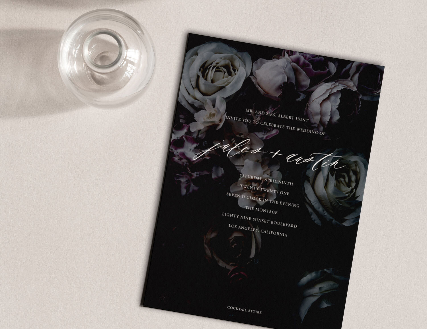
Letterpress wedding invitations press a metal or photopolymer die into heavy card stock, leaving a physical indentation that gives text and design a dimensional quality unique to the process. Run your finger across a letterpressed invitation and you feel the type before you read it. The impression is deepest and most precise on soft cotton stock; on standard paper the effect is less pronounced. Letterpress works best with two or fewer ink colors, with designs that benefit from shadow and depth, and with typefaces whose character is enhanced by the slight softening at the edges of each impression. It is slower and more expensive than any other printing method, which is the reason it signals quality as reliably as it does.
Engraving is the oldest formal printing method and remains the choice of the most traditional formal suites. The design is etched into a copper plate, filled with ink, and pressed onto the paper under significant pressure, producing letterforms with a sharpness and precision that no other printing technique replicates. A faint embossing is visible on the reverse of engraved cards. Engraving is best suited to finely detailed serif typefaces and formal designs where precision of letterform is the defining quality.
Foil stamping applies a metallic foil to the paper surface using heat and a die, creating a reflective finish that catches light differently at every angle. Gold foil on cream cotton stock is the reference pairing for formal elegance. Silver reads cooler and more contemporary. Rose gold offers warmth without the traditionalism of yellow gold. The most effective use of foil stamping is as an accent on a specific design element: the couple's names, a crest, a monogram, or a fine border detail. An invitation where foil is used selectively alongside letterpress or engraved body copy has more visual intelligence than a fully foil-stamped suite.
Blind embossing raises a design element from the paper surface without ink, creating a textural quality only visible in raking light. A blind-embossed botanical border, family crest, or monogram adds a layer of refinement to an otherwise restrained design without introducing any additional visual noise. It rewards guests who look closely.
Thermography produces raised letterforms by applying a resinous powder to freshly printed ink and heating it. The raised quality resembles engraving at a lower price point, though the finish is glossier and there is no reverse impression. For couples who want dimensional type without the full investment of engraving, thermography is a sound choice.
Digital printing should not be treated as a lesser option by default. On high-quality cotton stock, a digitally printed invitation can be visually indistinguishable in a photograph from a letterpressed one. The distinction is tactile. For couples whose budget prioritizes other elements of the wedding, a digitally printed invitation on 130 lb cotton with a strong design is more elegant than a poorly designed letterpress suite on thin uncoated card.
Paper is the medium through which every other design decision is experienced. It is also the element most often treated as a commodity choice rather than a creative one, which is why upgrading the paper stock has a more immediate impact on perceived quality than almost any other single change.
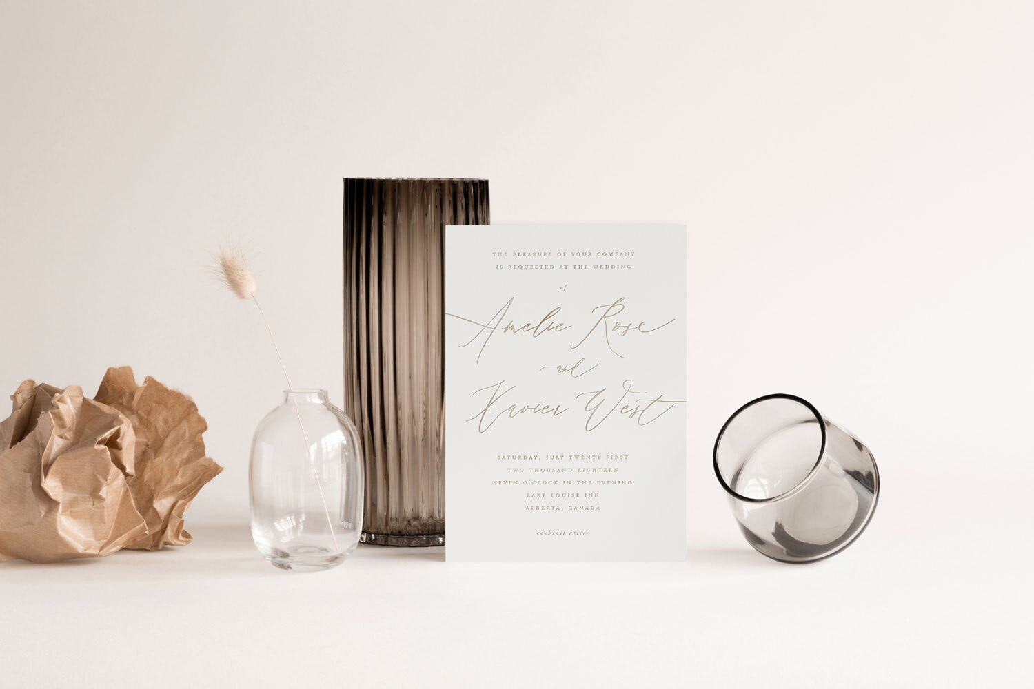
Cotton rag stock is the material that most clearly separates professionally produced wedding stationery from everything else. Made from cotton fiber rather than wood pulp, it has a soft, slightly textured surface that accepts letterpress impressions deeply, feels substantially different from standard card in the hand, and acquires a quality guests recognize as premium even when they cannot name the reason. Cotton stock in 110 lb or heavier weight is the foundation of truly elegant wedding invitations.
Heavy matte card in 110 lb or above provides a refined, unshiny surface that reads as considered and formal. Glossy finishes are widely associated with commercial print products: greeting cards, marketing materials, promotional flyers. Matte finishes read as designed rather than produced.
Vellum overlays are translucent sheets placed over the main invitation card, typically printed with the couple's names and date, and secured with a wax seal or ribbon. The transparency creates a soft layering effect that adds depth without obscuring the design beneath. Vellum is most effective when the typography on the overlay is set large enough to remain legible through the translucency.
Linen texture stocks have a crosshatched surface embossed into the paper during manufacture, producing a fabric-like appearance that suits traditional, botanical, and estate wedding aesthetics. The texture is more pronounced than the natural tooth of cotton stock and works best with text-focused designs where fine linework is not required.
Deckled edges are the rough, feathered margins created by hand-tearing or water-jet during paper manufacture. On an otherwise restrained and spare invitation, a deckled edge introduces the suggestion of handcraft without adding any visual decoration. It is most effective on off-white or natural cotton stocks with minimal ornamentation.
Pearlescent stocks have a subtle luster that catches light in the way soft fabric does. On formal invitations with gold or silver ink, a pearl-shimmer base stock adds an elegance that flat matte white cannot achieve. The effect should be used selectively: an entire suite on pearlescent stock risks reading as showy rather than refined.
Double-thick and triple-layer stocks laminate two or three sheets of card during production, creating an invitation with a cross-section color visible on the edges. A white outer layer with a black or colored core produces a card that reads as a single object when closed but reveals the interior color at every edge. The effect is architectural and precise, suited to minimal typographic designs where the card's physical construction becomes part of the design statement.
For couples drawn to the most refined end of this material range (heavyweight cotton, multiple printing techniques in one suite, fully bespoke design) the luxury wedding invitations collection shows how these decisions come together in finished suites ready to customize.
Typography is the design element guests register most viscerally without being able to name it. The same information set in a poorly considered typeface on a poorly spaced layout reads as amateurish. Set in an appropriate typeface with precise kerning, generous leading, and well-resolved hierarchy, the same information reads as composed and serious.
Classic serif typefaces remain the correct choice for traditionally formal elegant wedding invitations. Typefaces with historical pedigree, designed for display use at larger sizes, with well-drawn fine strokes and strong serifs, communicate formality through their visual history as much as their letterform quality. Typefaces designed for body text at small sizes, set at display scale on an invitation, produce thin, spidery strokes that undermine the quality of the paper and printing they appear on.
Script and serif pairings are the most widely used typographic system in wedding stationery because the contrast works: a calligraphic script for the couple's names conveys romance, while a formal serif for the body text conveys authority. The failure mode of this pairing is using a script that cannot hold its quality at text sizes. Choose scripts that remain readable across the full range of sizes they will be used.
Centered text is the correct alignment choice for formal invitations. Centered text has been the standard for formal event communication since printed invitations were first produced because it creates visual symmetry that reads as ceremonious. Flush-left alignment is appropriate for contemporary designs where the couple explicitly wants to depart from formal convention.
White space is a design element, not an absence of design. An invitation that uses generous margins and spacing between lines and design elements communicates confidence and quality. An invitation where every available surface is filled communicates anxiety about whether the design is interesting enough. Elegance requires the discipline to leave space.
Wording is where the etiquette of formal invitations is preserved or abandoned, and where many couples inadvertently undermine the elegance of an otherwise beautifully produced suite by using wording that does not match the visual register of the design. The full set of conventions is covered in our wedding invitation wording guide; the principles below cover what matters for elegance specifically.
The traditional formal request line uses either "request the honour of your presence" for ceremonies held in a house of worship, or "request the pleasure of your company" for civil and non-religious ceremonies. "Honour" uses the British spelling on formal invitations by convention, not error. These phrases have been in consistent use on formal invitations for over two centuries and carry the weight of that history.
The year is written out in full on formal invitations: "two thousand and twenty-six," not "2026." The time is expressed as "half after four o'clock," not "4:30 PM." These conventions apply to formal and semi-formal suites; contemporary suites using standard date and time formats are appropriate but signal a departure from tradition.
The host line appears at the top of the invitation, above the request. For a parent-hosted wedding: the parents' full names. For a jointly hosted wedding: "Together with their families." For a couple hosting their own wedding: the couple's names, without a preceding host line. The hosting format determines the grammatical structure of the entire invitation and the social signal it sends about who is welcoming guests.
Dress code belongs at the bottom right of the invitation card or on the details enclosure, not centered in the body copy. "Black tie" and "black tie optional" are the dress codes that belong on a formal invitation. More casual dress codes are better placed on the details card or the wedding website. Registry details never appear on the invitation regardless of how elegant or casual the suite.
An elegant invitation does not exist in isolation. It is part of a suite of related pieces, and the quality of the suite as a whole is determined by the coherence across every element, not only the quality of the main card.
The save-the-date is the first physical piece of wedding communication guests receive, and it sets the visual expectation the invitation either fulfills or betrays. A save-the-date that shares the typeface system, color palette, and material quality of the main invitation creates continuity. A save-the-date ordered from a different source with no visual connection to the invitation creates a jarring discontinuity in how the wedding presents itself.
The details card handles reception venue and timing, accommodation block information, and the wedding website address. On a formal suite, it is a separate card from the main invitation rather than a second side of the main card. Keeping them as separate pieces preserves the visual hierarchy of the suite and allows the main card to be treated as a keepsake.
The RSVP card is the most consistently underdesigned piece in wedding suites. A well-designed RSVP card uses the same paper stock, the same typeface, and the same printing method as the main card. It includes a pre-affixed stamp and a pre-addressed return envelope. Asking guests to source their own stamp is a breach of formal etiquette with no exception at any price point.
The envelope completes the physical presentation before the suite is opened. Envelopes for formal suites should be addressed by hand: a skilled calligrapher working in a script that coordinates with the suite's typeface is the correct choice for a truly elegant presentation. Digital calligraphy, printed directly onto the envelope, is an acceptable alternative. Printed address labels communicate that the invitation was produced on a production line.
The envelope liner adds an interior design element that guests encounter the moment they open the outer envelope. A botanical illustration, a geometric pattern, or a solid color in a palette that coordinates with the invitation suite creates a moment of discovery before the card is even visible.
The inner and outer envelope system is the traditional format for formal suites. The outer envelope carries the formal address. The inner envelope carries the names of the specific guests being invited, which is how the couple communicates who is and is not included in the invitation without requiring a note on the card itself.
The visual language of an elegant invitation is not universal: it is specific to the character of the wedding being announced. An invitation calibrated for a black-tie ballroom wedding reads as wrong for a garden ceremony at a country estate, even though both are formal occasions.
For black-tie and ultra-formal weddings, the correct approach is classical restraint applied to exceptional materials. Engraving or letterpress on heavyweight cotton, formal centered wording, a palette of black or navy on white or ivory, and no illustration. The invitation communicates formality through the precision of its execution, not through decorative ambition.
For formal garden and estate weddings, the visual language can accommodate botanical elements without sacrificing elegance. A fine-line illustration of a key plant from the ceremony garden, a watercolor botanical rendered with restraint, or an architectural detail of the venue provides specificity and elegance simultaneously. The key is restraint: one strong botanical element, not a field of competing florals.
For rustic elegant weddings — barn ceremonies, vineyard receptions, mountain venues — the visual language draws on natural materials handled with the same discipline as a formal suite. Heavyweight uncoated cotton, a restrained earth-tone palette, hand-lettered or fine serif typography, and a single architectural or botanical element specific to the venue produce a rustic invitation that reads as elegant rather than crafted. The failure mode of rustic suites is leaning too far into rope, burlap, and farmhouse iconography; the discipline is in the restraint.
For destination weddings with a formal register, the invitation has additional communicative work to do: it must establish the geographic character of the destination while remaining elegant rather than touristic. A fine map illustration of the destination, a color palette drawn from the local landscape, or an architectural motif from the venue grounds the design in place without resorting to vacation-brochure iconography. The same approach works for elegant beach wedding invitations, where the discipline is to evoke the coastal setting through a restrained palette and a single considered design element rather than seashells, anchors, or postcard imagery.
For contemporary formal weddings that want elegance without traditional convention, the typographic approach produces the strongest results. A single typeface family, expertly set, on exceptional paper, with no illustration and no decoration, communicates sophistication through design authority rather than through stationery tradition.
Many couples sending a formal printed suite also want digital communications to share the same visual register. A wedding website that uses the same typeface system as the invitation, the same color palette, and the same approach to typography and whitespace carries the elegance of the suite into every digital interaction guests have with the wedding.
Online wedding invitations designed to coordinate with a printed suite allow couples to maintain visual coherence across both formats. The design language established on the printed suite should be the source of truth for all digital communications: the same typographic hierarchy, the same color values using the hex codes from the stationer's digital files, and the same approach to negative space.
The wedding website URL belongs on the details card, not on the main invitation. Directing guests to a website from the formal invitation card introduces a digital element into a physical document in a way that can read as incongruous if not handled carefully.
Elegant wedding invitations require more production time than standard printed alternatives, and most couples discover this later in the planning process than they should. A full breakdown of the production stages and lead times appears in our wedding invitation timeline guide.
For digitally printed invitations on standard stock, the minimum timeline from order to delivery is typically two to three weeks. For letterpress invitations, allow eight to twelve weeks: the printing plates need to be produced, each color requires a separate press run, and cotton stock requires drying time between impressions. For engraved invitations, twelve to sixteen weeks is the appropriate planning window. For fully custom suites with bespoke illustration, begin the design process four to five months before the intended mailing date.
The mailing date itself is determined by when the invitations need to arrive in guests' hands. For domestic weddings, invitations should reach guests six to eight weeks before the wedding date. For destination weddings or events on holiday weekends with significant out-of-town guests, eight to twelve weeks is appropriate.
One timing error couples frequently make is completing the design before confirming every detail that appears on the card. A venue address that changes after the invitations are printed, a ceremony time that shifts, or a small name error discovered on delivery requires reprinting at additional cost. Proofread every version of the design against the original source documents, not against a previous proof.
Formal refers to the etiquette conventions governing wording, hosting structure, and information hierarchy. Elegant refers to the visual and tactile quality of the design and materials. A formal invitation should always be elegant, but not every elegant invitation is formally conventional. A contemporary suite using modern wording and flush-left typography on exceptional cotton stock with letterpress printing is elegant without being formally traditional.
Cotton rag stock in 110 lb or heavier weight is the standard for genuinely elegant suites. It accepts letterpress and engraving impressions more deeply than paper-pulp alternatives, feels substantially different in the hand, and communicates material quality before the guest has read a single word. Heavy matte stocks in the same weight range are the correct alternative for digitally printed suites. Gloss-coated stocks are associated with commercial print products and undermine the quality signals of elegant stationery.
Digitally printed invitations on premium cotton stock run $2 to $5 per piece. Letterpressed invitations run $6 to $14 per piece depending on the number of colors and design complexity. Engraved invitations begin at approximately $10 per piece and increase significantly with design complexity. Full custom suites with bespoke illustration and multiple printing techniques run $20 to $40 per piece. These figures cover the main invitation card; full suites including save-the-dates, details cards, RSVP cards, and envelopes are priced proportionally higher.
The mailing timeline is the same as for any invitation: six to eight weeks before the wedding for domestic events, eight to twelve weeks for destination weddings or holidays. What changes with an elegant printed suite is when the design process must begin. For letterpress or engraved suites, begin working with the designer or stationer four to six months before the intended mailing date to accommodate production.
Yes. An elegant digital invitation uses the same design principles as an elegant printed one: restraint in typography, a deliberate color palette, exceptional typographic hierarchy, and no decorative elements that were not chosen for a reason. The material quality of cotton stock and the tactile quality of letterpress cannot be replicated digitally, but visual elegance translates fully to screen when the design decisions are sound.
Registry details never belong on a wedding invitation at any formality level. Dress codes phrased as instructions rather than descriptions read as informal. Casual language that does not match the visual register of the design creates a tonal mismatch that guests notice even when they cannot articulate it. URL addresses appearing on the main invitation card, rather than on a details insert, introduce a digital element that can disrupt the visual formality of a classically produced piece.
The visual language of the invitation should be established first and then used as the source of truth for all other design decisions. The color palette, typeface choices, and design sensibility from the invitation should inform the wedding website, ceremony programs, menus, and signage. When the invitation is designed independently and every other element is designed to match it afterward, the cohesion is natural.
At Bliss and Bone, elegant wedding invitations are designed as part of a complete suite rather than as standalone pieces. The same visual system extends from the save-the-dates through the day-of stationery, so every touchpoint guests have with the wedding shares the same typographic register, palette, and material quality.
Browse the full wedding invites collection or start a conversation about a custom suite designed specifically for your wedding.
